
Selling a product whose value is a phone call
Aurora calls hundreds of local businesses on your behalf and comes back with verified quotes. The hard part of the website was never explaining the feature — it was making a claim about the offline economy credible enough that a stranger would install an app on the strength of it.
- Role
- Design and front-end build, end to end
- Surface
- Marketing site, App Store and Play Store funnels
- Scope
- 9 bands, 6 sub-pages, 5 product films
01The brief
What the page had to earn
Aurora is an agent that dials real businesses and brings back real prices. That is easy to describe and very hard to believe, because every product in this category has trained people to expect a list of links. The site had one job and it was not education.
The one jobMake a stranger believe that a piece of software will phone a hundred shops for them and come back with numbers a human actually said — then get them into an app store before that belief cools.
Primary
Someone in the middle of a chore
They need a plumber tonight, a caterer for forty people, or a part nobody stocks. They are not shopping for AI — they are trying to stop making phone calls. The site has to land inside a task they already resent.
Secondary
The sceptic who has been burned by an AI demo
They assume the prices are generated. They will scan for evidence and leave the moment they cannot find any. Everything above the fold has to survive that scan.
Third
Investors and press arriving from a link
They want the market claim and the wedge in under thirty seconds, in language they can repeat. The problem band and the head-to-head exist mostly for them.
Constraints
- No social proof
- A pre-launch consumer app has no logo wall, no testimonial, no download counter. Proof had to come from the product itself rather than from other people.
- Two app stores
- iOS is the real surface and Android trails it. The page has to push both without implying they are equivalent.
- Bring your own media
- No photography budget and no stock. Everything visual is either real product UI, a real call recording, or drawn.
- Legal surface
- App-store review needs support, terms, privacy, security and account deletion reachable from every page. That is five links that must not clutter the nav.
Built with
- Next.js App Router
- CSS Modules
- Framer Motion
- Inter
- Ancizar Serif
- Caveat
- Static MP4
02The argument
A scroll is a sentence
Every band is one clause. Read top to bottom, the page has to make a single argument — so each band gets a claim, and a reason it is allowed to take up the height it takes up.
- 01
Hero — the ask, rotating
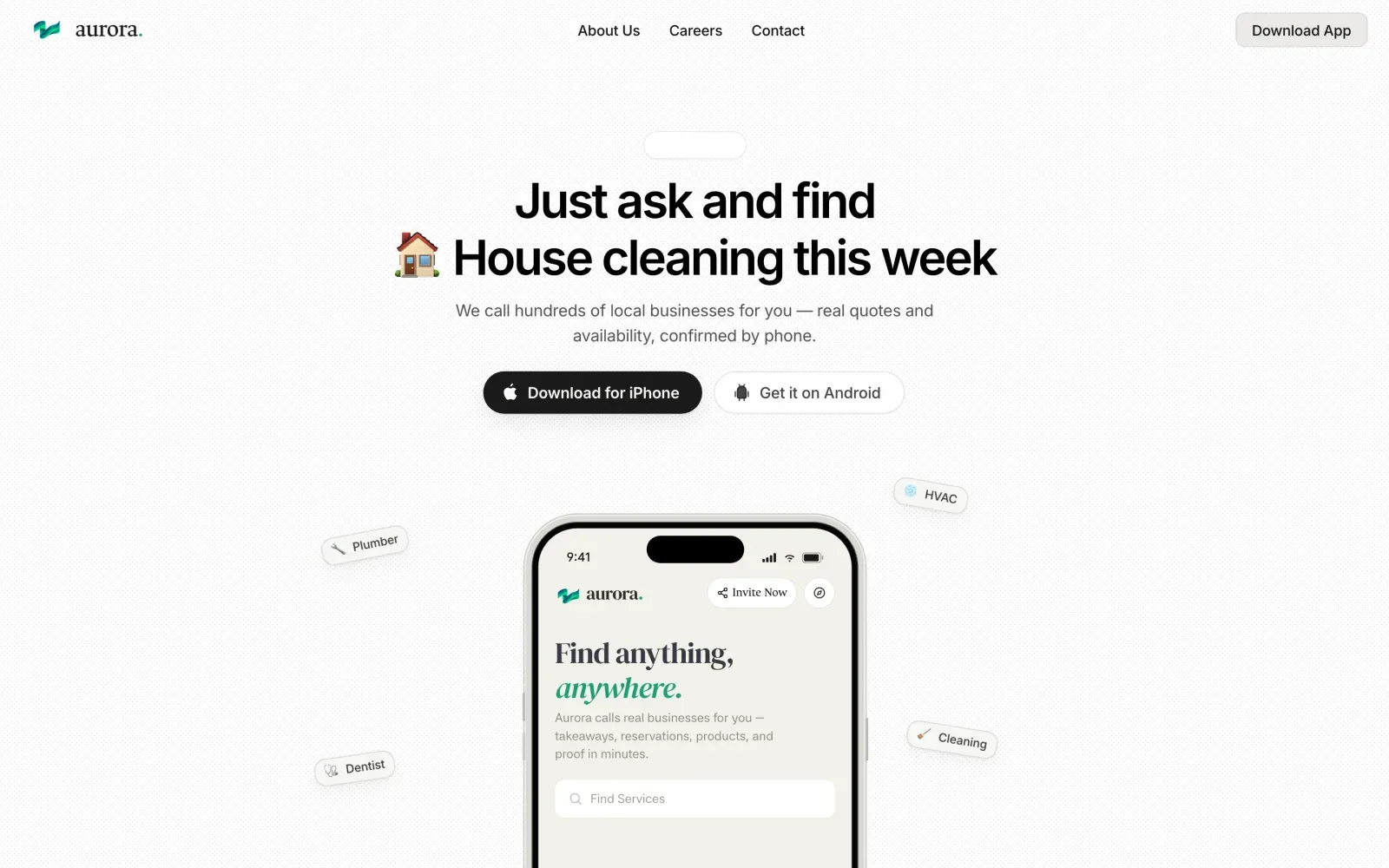
“Just ask and find ___” where the blank cycles through trade-show booth builders, house cleaning, HVAC repair. Below it: we call hundreds of local businesses for you.
BecauseA fixed headline forces one example, and one example always excludes the visitor's actual chore. Rotating the noun makes the category feel unbounded without a single word of copy claiming that it is.
- 02
Live query marquee
Two counter-scrolling rows of real searches — “Wholesale coffee beans 50 lbs”, “Locksmith open right now”, “Tree removal estimates”.
BecauseThe rotating headline shows one ask at a time. The marquee shows forty at once, which is how you make a claim about breadth without writing the word “anything” a fourth time.
- 03
The problem, in three failures
It is not online. Stuck on hold. One call at a time. Three cards whose connector lines converge into the Aurora mark, resolving into “we do all of this for you”.
BecauseThe headline concedes the thing the visitor already believes — the search was never the hard part — and then names the three costs they have absorbed so many times they stopped noticing. Naming the pain is what earns the right to make a claim.
- 04
Head-to-head against the real alternatives
One question — florists who can deliver roses by 5pm today — asked of Search, LLMs, Directories and Aurora, with each incumbent's answer quoted and its failure phrase highlighted.
BecauseAurora's competition is not another agent, it is Google plus an afternoon. Quoting the incumbents verbatim and highlighting the exact clause that hands work back to the user is a stronger argument than any adjective, and it is falsifiable — anyone can go and check.
- 05
Real calls, real proof
A product window with an audio player, a waveform, and the full transcript of a four-minute call with a San Francisco caterer — pricing, staffing, minimums, gratuity.
BecauseThis is the band the entire site exists to reach. Every other section makes a promise; this one is the receipt. The transcript is deliberately long and unedited, including the “Um”s, because a tidy transcript reads as written and a messy one reads as recorded.
- 06
What's inside
Five capability cards — search anything, nothing you can't check, calls every shop at once, tell it what changed, call one one-on-one — each with a small live diagram rather than an icon.
BecauseFeatures come after proof, never before it. By this point the visitor believes the mechanism, so the feature grid is answering “what else” rather than trying to establish credibility on its own.
- 07
How it works, as a pinned sequence
Ask, Clarify, Discover, Call, Deliver — five stages, each pinned with a phone playing the real app film and a handwritten note in the margin.
BecauseFive stages in a static row reads as a process diagram nobody looks at. Pinning it makes the scroll itself do the sequencing, and the Caveat margin notes carry the tone a UI screenshot cannot.
- 08
The seven questions people actually ask
Including the two uncomfortable ones: does Aurora spam the businesses it calls, and what if it gets something wrong.
BecauseAn FAQ that only asks flattering questions is marketing. The objection handling is the point — a visitor who is worried about spam and cannot find the word “spam” on the page assumes you are hiding from it.
- 09
Footer as second hero
Full-bleed aurora landscape, both store buttons repeated, a giant ghosted wordmark, and every legal route.
BecauseLong-scroll pages lose the conversion affordance the moment the hero leaves the viewport. The footer is a second hero with the same two buttons, and it absorbs the five compliance links without them ever touching the top nav.
03Architecture
Every route, and what it is for
One long home page carries the whole argument; everything else is a leaf that exists because the App Store, a recruiter, or a lawyer needs it to. Nothing lives more than one click from the root.
/Home
The full argument in nine bands. Every other route is reachable from its nav or footer.
/#differentWhy Aurora
Deep-links straight into the head-to-head comparison — the section most likely to be shared.
/#featuresFeatures
Skips the argument for visitors who already know what Aurora is.
/#faqFAQ
Reachable from the nav, the footer and search results.
/aboutAbout Us
Team and the offline-economy thesis.
/careersCareers
Nav-level because early hiring is a real goal of the site.
/contactContact
Third nav slot, next to the only action.
/supportSupport
Footer only. Required by app-store review.
/termsTerms
Footer and the bottom bar.
/privacyPrivacy
Footer and the bottom bar.
/securitySecurity
Asked for by anyone evaluating a product that records calls.
/delete-accountDelete Account
A store requirement, kept as a first-class route rather than buried in a help centre.
apps.apple.com/…/id6777149885App Store
The primary conversion. Appears in the nav, the hero and the footer.
play.google.com/…/com.auroraxPlay Store
Always second, always the outline button.
04The system
Type, colour and the grid
Warm paper, near-black ink, and one green that is only ever allowed to mean “verified”. The restraint is load-bearing: on a page whose whole argument is that its data is real, a decorative gradient would read as a tell.
Display / H1
Inter · 50px · 600
Just ask and find
Section head / H2
Inter · 36px · 600
The hard part was never the search.
Card title / H3
Inter · 21px · 600
Florists who can deliver roses by 5pm
Feature title
Inter · 17px · 600
Nothing you can’t check
Body
Inter · 16px · 400
Real quotes and availability, confirmed by phone.
In-product accent
Ancizar Serif · 28px · 400
Find anything, anywhere.
Margin note
Caveat · 20px · 400
just ask — plain English, no filters
Eyebrow chip
Inter · 13px · 500
Real calls, real proof
Palette, sampled off the built page
Paper
#F6F5F2Page canvas, with a fine dot texture over itInk
#1A1A19All headings and primary buttonsInk 62
#343433Body copy and quoted incumbent answersVerified
#0C8A5CThe only accent. Reserved for confirmed factsVerified deep
#047857Hover and the aurora mark's darker facetMint
#3ECF8EWaveforms, in-stock ticks, the footer glowSurface
#F0EEEACards, chips, the marquee trackHairline
#D7D7D4Every rule and card border on the page- Container
- 1200px, 24px gutters, centred
- Band rhythm
- 128px vertical padding desktop, 80px under 768px
- Radius
- 12px cards · 999px chips and buttons · 44px product windows
- Texture
- A 1px dot grid at 4% over the paper, so flat areas are never truly flat
- Elevation
- Two shadows only: a resting hairline and a lifted 24px blur
- Page weight
- 9,613px tall; five MP4 films loaded lazily per stage
05Band by band
The whole page, with the reasoning pinned on
Nine bands, thirty-nine decisions. Pick a band from the contact sheet, then a pin — each one is a decision and the reason it beat the obvious alternative.
Job of this bandMake an unbelievable claim, then hand over two buttons before the doubt arrives.
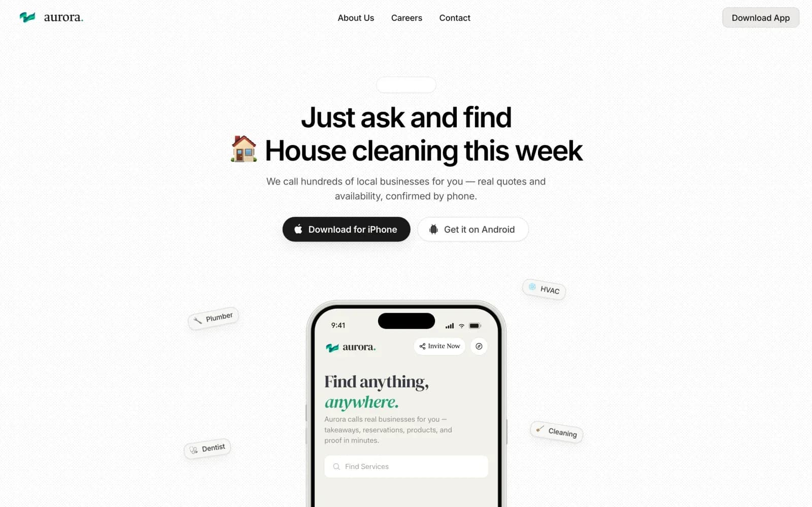
“Just ask and find ___” cycles through trade-show booth builders, house cleaning, HVAC repair — each with its own emoji, swapped on a timer with a soft vertical wipe.
WhyAny fixed example excludes the chore the visitor actually arrived with. Rotating the object makes the category read as unbounded without the copy ever claiming “anything”, which nobody believes anyway.
“We call hundreds of local businesses for you — real quotes and availability, confirmed by phone.”
WhyBenefit-first copy (“find anything instantly”) is indistinguishable from every other AI landing page. The mechanism is the differentiator, so the mechanism goes in the second line, and “by phone” does the heavy lifting.
Download for iPhone is a filled black pill; Get it on Android is an outline of the same size.
WhyiOS is where the product actually is. Two identical buttons would split attention evenly across two platforms that are not evenly ready — the weight difference routes the majority without excluding anyone.
Not a stylised abstraction — the actual app home with its serif “Find anything, anywhere” and the live Find Services field.
WhyThe hero is asking for an install. Showing the exact screen they will land on is the cheapest possible reduction in the gap between the ad and the product.
Plumber, HVAC, Dentist, Cleaning — small tilted pills that float on slow independent loops with a slight parallax against pointer movement.
WhyThey do two jobs at once: they show breadth of category, and they make a static screenshot feel like a running system. The tilt keeps them reading as stickers rather than as UI the visitor might try to tap.
About Us, Careers, Contact centred; Download App alone on the right in a filled chip.
WhyThe site has twelve routes and five of them are legal. Letting only three into the nav keeps the single conversion affordance unambiguous — the footer carries the rest without competing.
#F6F5F2 with a 1px dot texture at four percent opacity across the whole canvas.
WhyPure white plus a green accent is the default AI-product look. A warm off-white with visible grain reads closer to print, which is the register a page arguing about verified evidence wants to be in.
Pick a pin7 decisions are pinned onto this band.
06Motion
What moves, when, and how fast
The page has one reveal gesture and four set pieces. Everything else is static on purpose — on a page whose argument is that its data is real, motion that exists only to look expensive reads as a distraction from the evidence.
The house reveal
In view, once, 60px before the edgeopacity 0→1, translateY 18→0, blur 6→0 · 620ms · cubic-bezier(.22,1,.36,1)Every band inherits the same curve and distance, so scrolling feels like one continuous document rather than a stack of independently animated widgets. One gesture, reused, is what makes a long page feel authored.
Rotating headline noun
2.6s timer, paused off screenVertical wipe, clip-path + translateY 100%→0 · 420ms · staggered 24ms per glyphA crossfade between two words of different lengths reads as a glitch. A wipe reads as a mechanism turning over, which is the impression the hero wants.
Converging connectors
Problem band entersstroke-dashoffset full→0 · 900ms · staggered 120ms · ease-outThe band's argument is that three costs collapse into one thing. Drawing the paths lets the animation carry the argument instead of decorating it.
Pinned stage sequence
Scroll position within the pinned band5 stages over 5× viewport height; film cross-fade 320ms; stage word weight 300→600Scroll distance is the only honest way to represent a process that genuinely takes minutes. Pinning converts the visitor's own scrolling into the passage of time.
Nav condense
scrollY > hero heightmax-width 100%→720px, radius 0→999px, backdrop-blur 0→14px · 260msIt signals “you have left the top” without a progress bar, and it keeps the warm canvas continuous instead of cutting the page with a full-bleed bar.
Marquee drift
Always, two rows counter-scrollingtransform translateX, 42s and 56s linear, infinite, paused on hoverDifferent durations stop the two rows from beating against each other in a visible pattern. Pausing on hover matters because these are real queries people may want to read.
Floating service chips
Always + pointer parallaxtranslateY ±8px on 5–7s loops, rotate ±3deg, 12px pointer offset · spring(220, 40)Independent periods keep the group from looking like one animated block, and the pointer parallax gives the hero depth without a single gradient.
Reduced motion
prefers-reduced-motion: reduceAll loops stop, pinning releases to a static stacked layout, reveals become instantThe pinned section is the risky one — it is the only place where disabling motion changes layout rather than just timing, so it degrades to five plain stacked stages rather than to nothing.
07Responsive
What survives the fold down to 390px
The desktop page argues in two columns; the phone cannot. Rather than stack every band, three of them change shape — the comparison becomes a swipe, the pinned sequence unpins, and the transcript gets its own scroll container.
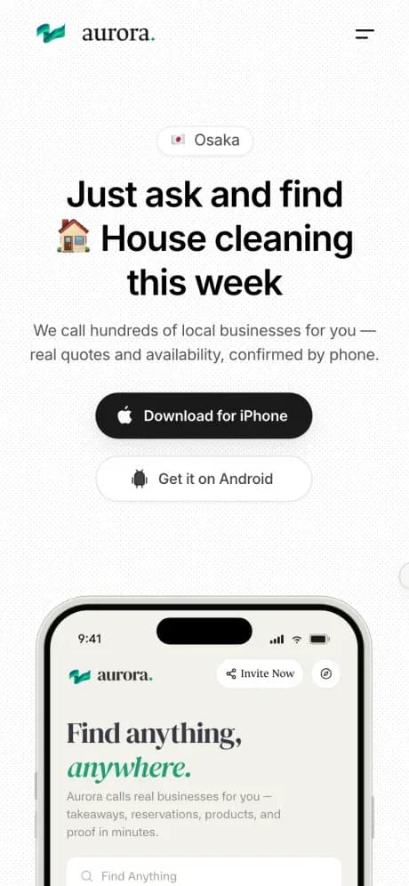
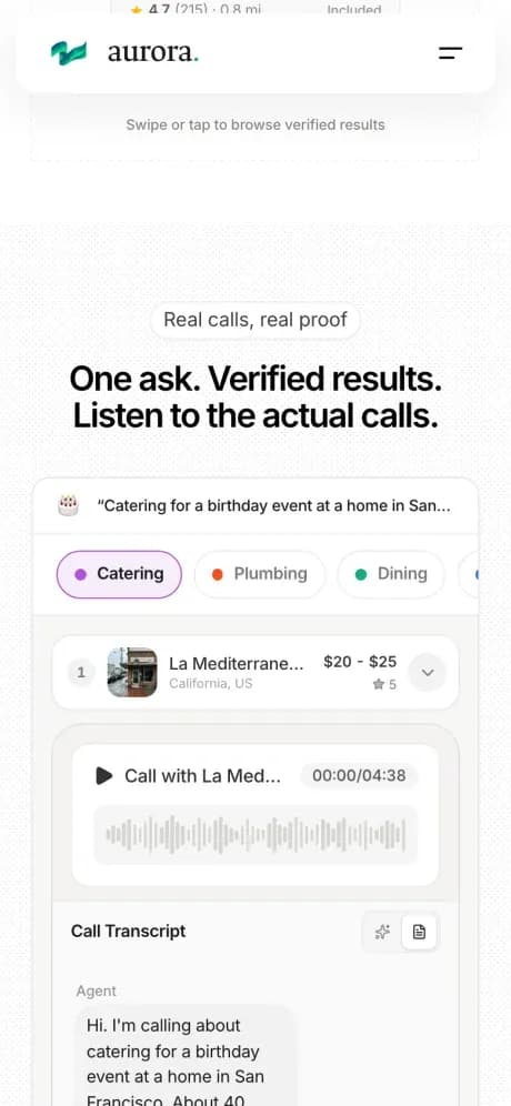
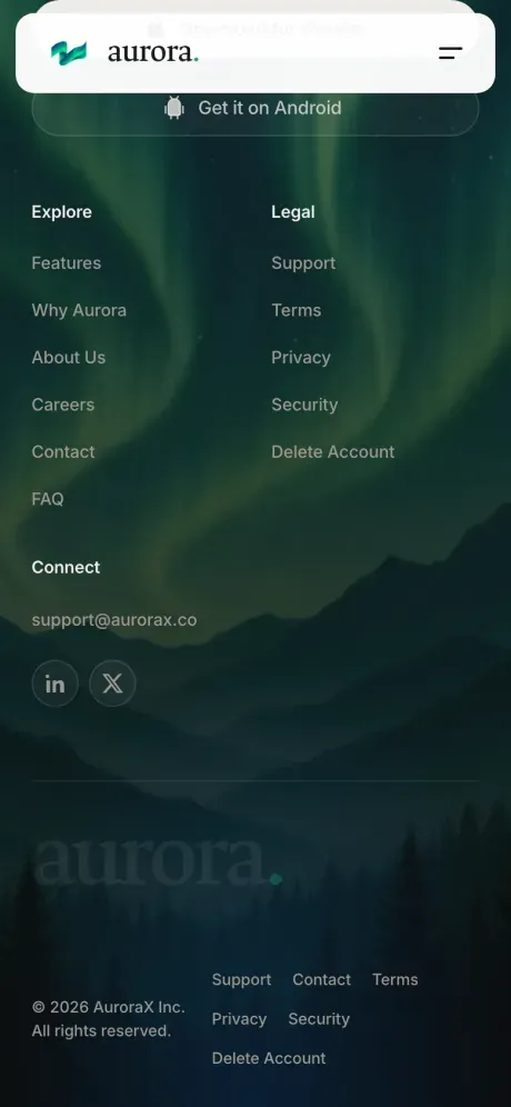
- Breakpoints at 1200, 1024, 768 and 480 — set by where the content actually breaks, not by device names.
- The comparison band becomes a scroll-snap carousel below 900px. Four columns of quoted text at phone width would truncate every one of them, and a truncated quote cannot be checked, which defeats the band.
- The pinned how-it-works sequence unpins below 768px and becomes five stacked stages, each with its own film. Scroll-jacking on a touch device fights the platform's own momentum.
- The call transcript gets a max-height and its own scroll container on phones, so a four-minute call cannot push the rest of the page five viewports down.
- Store buttons go full-width and stacked, iPhone first. A 44px minimum target is enforced on every chip and accordion row.
- The hero headline's rotating noun is length-capped on small screens so the line count never changes mid-rotation — a headline that reflows as it animates reads as broken.
- The dot texture is dropped under 480px. At that scale it costs a repaint on every scroll frame and is effectively invisible.
08What it moved
Numbers, lessons, and what is still open
The site is the front door for an app whose core promise cannot be demonstrated without a phone line. What it had to prove, it proves with its own artefacts.
9
Bands, one argument
Problem, contrast, proof, capability, sequence, objection, action — in that order, and the order was the expensive decision.
4:38
Of unedited call audio
A full caterer negotiation, disfluencies intact, sitting on the marketing page rather than behind a demo request.
5
Real product films
One per stage of the pinned sequence. No mockups and no stock footage anywhere on the site.
12
Routes, 3 in the nav
Five legal pages required by store review, all reachable, none of them in the top bar.
What I would keep
The instinct was to trim the transcript to a tidy exchange — question, price, done. Every trimmed version read as copywriting. The version that convinces is the one that is slightly too long, where the caterer hedges about arrival windows and corrects themselves about gratuity. Credibility came from the parts a designer would want to remove, which is an uncomfortable thing to design around and the single most useful thing this project taught me.
An early build put features third, straight after the problem. It tested badly in the most literal way possible: people scrolled past the proof band entirely, because by then they had decided the prices were generated and there was nothing left to check. Moving proof above features cost nothing to build and changed how the whole page reads. Sequence is the highest-leverage decision available on a landing page and it is almost always treated as an afterthought.
A feature matrix with ticks and crosses invites the reader to audit whether the rows were chosen fairly, and they were not — nobody's ever are. Asking one question, showing four verbatim answers, and highlighting the exact clause where each one hands the work back is both more honest and more persuasive, because the reader can go and re-run it in another tab. Falsifiable claims are stronger than favourable ones.
Green appears on this site only where something has been confirmed by a call. That rule made a lot of layout decisions automatic — no green buttons, no green gradients, no green illustration. It also means a visitor learns the colour's meaning in the problem band and can read the rest of the page by scanning for it.
Still open
- The App Store conversion is unattributed. There is no route-level tracking distinguishing hero installs from footer installs, so the argument for the footer-as-second-hero is design reasoning rather than measurement.
- The transcript band is desktop-first. On a phone it works but it is the one place where the layout is a compromise rather than a decision.
- Android is treated as a secondary surface throughout. That reflects the product today, but the outline button will need to become a real peer before launch.
- No structured data on the FAQ band yet — seven well-written question-and-answer pairs are sitting there without FAQPage markup.
- The marquee queries are hard-coded. They should read from actual anonymised searches so the breadth claim is evidenced the way the rest of the page is.