
Selling AI into a room that gets audited
Cune is an AI workspace for commercial P&C underwriting. Its buyers are not early adopters — they are people whose decisions get re-read by a regulator two years later. The site had to argue for speed without ever implying that speed comes at the cost of a defensible file.
- Role
- Site design, message architecture and build
- Surface
- Marketing site, demo booking, product login
- Scope
- 6 bands, 4 sub-pages, 6 FAQ objections
01The brief
What the page had to earn
Every AI product sold into insurance makes the same promise about speed, and every underwriter has learned to hear that promise as a threat to the audit trail. The site's problem was not attention — it was that its strongest claim is also the one most likely to get it disqualified.
The one jobConvince an underwriting head that Cune makes their desk three times faster and their files more defensible at the same time — and that neither claim requires an integration project to test.
Primary
The underwriting head with a governance problem
They are measured on consistency across a desk, not on individual speed. They need to know what the machine did, what a human did, and whether the reasoning survives being re-read in two years.
Secondary
The underwriter who has been handed a tool before
They have been through a platform rollout that added work. They are scanning for whether this is another system to keep updated, and the phrase they are looking for is “no integration required”.
Third
The buyer who has to justify the line item
Three numbers they can take into a budget conversation. This is why the stat row sits in the hero rather than halfway down the page.
Constraints
- Regulated buyer
- No claim can outrun what the product can evidence. “Audit ready” has a specific meaning to this audience and using it loosely is disqualifying.
- Framer, not code
- Built for a founding team that needs to edit copy weekly without a deploy. That choice trades away some semantic control, and the study is honest about where it cost something.
- No named logos
- Early pilots are under NDA, so the credibility burden falls entirely on the mechanism and the FAQ.
- Two entry actions
- A self-serve login and a booked demo, aimed at different people, competing for the same slot in the hero.
Built with
- Framer
- Geist
- Inter
- Satoshi
- Cal.com
- Framer Motion
02The argument
A scroll is a sentence
Every band is one clause. Read top to bottom, the page has to make a single argument — so each band gets a claim, and a reason it is allowed to take up the height it takes up.
- 01
Hero — the category, then the receipts
“AI Workspace for Commercial Insurance Underwriting”, a sentence about turning messy submission packets into quote-ready files, two buttons, and 90% / 3× / 30% underneath.
BecauseThis buyer will not scroll on the strength of a verb. Naming the exact category in the H1 disqualifies the wrong visitor in one line, and putting the three numbers above the fold gives the right one something to carry into a budget meeting.
- 02
Meet Cune — three steps, and a concession
Forward or upload files → Understand & Enrich → Assemble, joined by a dashed path. Then a full-width line: this is what your underwriter assistant team does today; Cune does it instantly, consistently, and with traceability.
BecauseThe concession is the most important sentence on the page. It reframes Cune as a faster version of work the desk already trusts rather than a new decision-maker, which is the objection that kills AI deals in insurance.
- 03
Features — four capabilities, in trust order
Instant understanding of the risk, AI agents that work like specialists, accuracy and citations, deploy in a day.
BecauseCitations before agents would have been safer; agents before citations would have been braver. The order lands on capability, then the specialist framing, then the audit trail, then the objection about implementation cost — each card answering the doubt the previous one creates.
- 04
Why Cune — a two-column before and after
Other Tools in white with five crosses, With Cune AI in full brand blue with five ticks.
BecauseThe negative column is stated as a description of today rather than an attack on a named competitor, which keeps the page usable in a room where the incumbent might be someone's own spreadsheet. The colour inversion does the arguing.
- 05
Benefits — three outcomes, restated as claims
90% faster intake to quote, uplift in high-appetite premiums, bespoke to your appetite and gets smarter with use — each with a blue illustration panel.
BecauseThe hero's three numbers arrive without support. This band is where each one gets a paragraph, so the stat row can stay terse above the fold and still be defensible by the time the visitor reaches the demo button.
- 06
FAQ — six objections, including the two hard ones
Will our data be used to train your models? Are you just an LLM wrapper? Plus appetite learning, agents, auditability and implementation.
BecauseIn enterprise insurance the FAQ is not an afterthought, it is the qualification call happening in advance. Two of the six questions are ones a vendor would rather not print, which is exactly why they close the deal.
03Architecture
Every route, and what it is for
A single-page argument with anchor navigation, three leaf pages, and one external hand-off to the product. The nav deliberately hides the section anchors behind a single “Product” label so the top bar stays at four items.
/Home
The whole argument in six bands. Anchors carry all in-page navigation.
/#heroHome anchor
The nav's Home link scrolls rather than reloads — the page is the site.
/#meet-cuneHow it works
Footer-level. The three-step band.
/#featuresFeatures
Footer-level, and the destination of the Product nav item.
/#why-cuneWhy Cune
What the Product nav item actually resolves to — the comparison band.
/#benefitsBenefits
Footer-level. Where the hero's three numbers get their evidence.
/#faqFAQs
Footer-level. The six objections.
/contactContact us
Third nav slot. The path for a buyer who wants a person, not a calendar.
/termsTerms & Conditions
Footer only.
/privacyPrivacy Policy
Footer only, and load-bearing for a buyer who asks about data handling.
product.getcune.com/loginLog In / Sign In
Top-right, and the hero's primary button. The self-serve path.
cal.com/founders-office-cune/30minBook Demo
A 30-minute slot with the founder's office, not a lead form.
linkedin.com/company/cune-aiFooter. The only social channel, which is correct for this buyer.
04The system
Type, colour and the grid
One blue, a warm near-black, and a great deal of white. The palette is doing something specific: in a category where every competitor ships a purple-to-blue gradient, a single flat brand blue used only on affirmatives reads as a product that does not need to look futuristic.
Hero / H1
Geist · 60px · 500
AI Workspace for Commercial Insurance
Section head / H2
Geist · 48px · 400
Experience the Cune Advantage
Benefit claim / H2
Geist · 42px · 400
90% faster intake to quote process
Closing CTA / H1
Geist · 55px · 500
Ready to Modernize Your Underwriting?
Card title
Geist · 22px · 500
Accuracy, Consistency & Citations
Body
Inter · 17px · 400
Transform messy submission packets into quote ready files.
Eyebrow chip
Inter · 14px · 500
Features · Why Cune · Our Benefits
UI label
Satoshi · 13px · 500
Successfully Analyzed · Poor-fit business
Palette, sampled off the built page
Canvas
#FEFEFEPage background. Effectively white, deliberately not #FFFWarm ink
#1E0D01Every heading. A brown-black, not a neutral oneInk
#000000Body copy and list itemsBrand blue
#478EFFThe only accent. Affirmative panels, ticks, primary buttonBlue wash
#F2F7FFThe hero's radial haze and card groundsMuted
#888888Sub-copy and stat captionsSlate
#616161Secondary body on white cardsHairline
#EDEDEDCard borders and FAQ row edges- Container
- 1200px centred, 40px desktop gutters
- Band rhythm
- ~120px vertical padding; the benefits band runs to 1,445px
- Radius
- 8px chips · 20px cards · 28px the blue illustration panels
- Card fill
- A near-invisible #FAFAFA on white, edge defined by shadow rather than border
- Blue panels
- Flat #478EFF with a soft outer glow — no gradient anywhere on the site
- Page weight
- 7,964px tall, no video, all illustration is vector or PNG
05Band by band
The whole page, with the reasoning pinned on
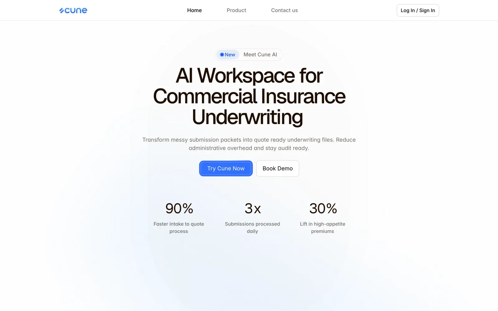
Six bands, thirty-two decisions — including two that are wrong. The live site ships a mis-assigned primary button and a heading level that does not survive a screen reader, and both are pinned here rather than cropped out.
Job of this bandName the category precisely enough to disqualify the wrong visitor, then hand the right one three numbers.
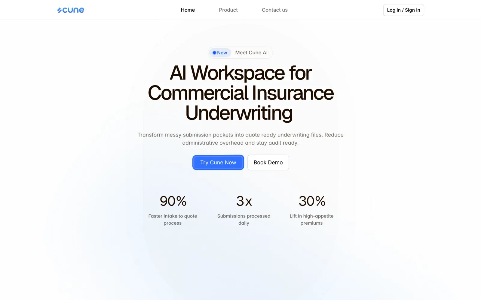
“AI Workspace for Commercial Insurance Underwriting” — sixty pixels, five words of category, no verb.
WhyA benefit headline (“Underwrite faster”) would pull in every insurance-adjacent visitor and convert none of them. Naming commercial P&C underwriting explicitly costs traffic and buys the only visitors who can sign.
“Transform messy submission packets into quote ready underwriting files. Reduce administrative overhead and stay audit ready.”
Why“Messy submission packets” is the phrase this buyer uses about their own inbox. Starting from their vocabulary rather than the product's is what earns the second sentence, and “audit ready” lands only because it arrives after the admin claim rather than instead of it.
90% faster intake to quote · 3× submissions processed daily · 30% lift in high-appetite premiums.
WhySpeed, throughput and portfolio quality — the three axes an underwriting head is actually measured on. They are stated bare here and fully evidenced in band 05, which lets the hero stay terse without the claims being unsupported by the time the demo button appears.
Try Cune Now in brand blue with a visible press-ring; Book Demo in white with a hairline border.
WhyThe wedge is that Cune needs no integration to start, so the product itself is the strongest demo available. Making the login primary is a bet on that claim — and the outline demo button keeps the path open for the buyer who will never self-serve.
A blue “New” pill followed by “Meet Cune AI”, linking back to the same page.
WhyIt is the cheapest possible signal that the product is being actively shipped, which matters disproportionately for an early company with no logo wall. The dot is doing work no sentence could do as briefly.
A very soft blue-white ellipse behind the copy, no illustration and no product screenshot.
WhyA dashboard screenshot at this size would be unreadable and would date the page every time the product shipped. The wash gives the headline a stage without adding a single claim that has to stay true.
Home · Product · Contact us, with Log In / Sign In outlined at the right.
WhySix in-page anchors in the top bar would turn the nav into a table of contents for a page the visitor has not read yet. Collapsing them behind Product and exposing the full set only in the footer keeps the bar at reading weight.
Pick a pin7 decisions are pinned onto this band.
06Motion
What moves, when, and how fast
Restrained on purpose. This buyer reads a page that performs as a page trying to distract them, so the site keeps one entrance gesture, one drawn diagram, and hover states that only ever reveal information.
Band entrance
In view, onceopacity 0→1, translateY 24→0 · 500ms · ease-outNo blur, no scale, no stagger beyond the card grid. The most conservative reveal that still tells the eye a new band has started.
Stat row count-up
Hero mount, 400ms after paint0→90 / 0→3 / 0→30 · 1,100ms · ease-out-quint, unit glyph staticThe numbers are the hero's whole payload, and counting draws the eye down from the H1 to them. Keeping the % and × static stops the row from looking like a slot machine.
Three-step path draw
Meet Cune band entersstroke-dashoffset full→0 · 1,200ms · ease-in-out, nodes pop at 30% and 65%The path is the sequence. Drawing it means the order is communicated by motion, so the band needs no step numbers and no arrows.
Feature card lift
Pointer entertranslateY 0→-4px, illustration filter grayscale(.7)→0, shadow 8→24px · 260msDesaturating everything until hover lets the band hold four illustrations without becoming the loudest thing on a deliberately calm site. The lift is small enough to feel like paper.
FAQ row expand
Clickgrid-template-rows 0fr→1fr, glyph + → × · 340ms · cubic-bezier(.22,1,.36,1)Animating grid rows rather than max-height means the transition works at any content length, which matters when one answer is ninety words and another is fifteen.
Nav underline
Scroll positionActive nav item weight 400→500, 2px underline slides · 220msThe nav has three items covering six anchors, so the visitor needs some signal about where they are. Sliding one underline is cheaper to read than restyling three labels.
Reduced motion
prefers-reduced-motion: reduceCounters render final values, paths render complete, entrances become instantEvery animation on this site has a legible static end state, which is why disabling all of them costs the page nothing. That was a design constraint, not a fallback.
07Responsive
What survives the fold down to 390px
The desktop layout is two-column everywhere; the phone version has to keep the comparison band paired and the benefit rows in claim-then-illustration order, which stacking gets wrong by default.
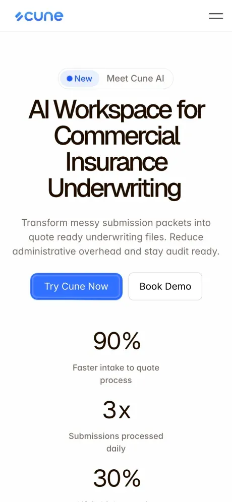
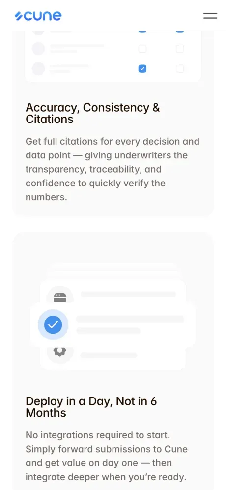
- Breakpoints at 1200, 810 and 480 — Framer's defaults, retained because the content happens to break at all three.
- The Why Cune comparison stacks blue-panel-first on mobile. Preserving desktop order would make the visitor read five failures before any solution, which inverts the argument on the device where they are least patient.
- Benefit rows always render claim above illustration, never the reverse. Two of the three are illustration-left on desktop, so the stack order is set explicitly rather than inherited.
- The three-step path rotates from horizontal to vertical and keeps its dashes, so the sequence survives the axis change.
- The hero stat row becomes a horizontally scrollable strip. Three 42px numbers in a 390px grid would wrap their captions to three lines each.
- FAQ rows get 48px minimum height and a full-width hit area — the glyph is decorative, the whole row is the target.
- The nav collapses to a hamburger at 810px, with Log In / Sign In promoted out of the drawer and pinned to the bar.
08What it moved
Numbers, lessons, and what is still open
A page for a buyer who has been pitched AI a dozen times and has a compliance obligation. Its job is not excitement — it is removing every reason to say “send me something in writing”.
6
Bands, one concession
The “this is what your analyst does today” line is the pivot the other five bands are arranged around.
3
Numbers, twice
Stated bare in the hero, evidenced with a paragraph each in band 05, in the same order both times.
2 / 6
FAQ questions a vendor would omit
Model training on customer data, and the wrapper accusation — both printed in the buyer's blunt phrasing.
1
Accent colour, no gradients
Flat #478EFF used only on affirmatives, in a category that defaults to purple-blue gradients.
What I would keep
The line that does the most work on this page is the one that gives ground: this is what your analyst team already does, Cune just does it instantly and traceably. Positioning the product as an accelerant on a trusted process rather than a replacement for a judgement call is what makes it discussable in a regulated desk at all. I would now write that sentence before writing the hero, because everything above it exists to earn the right to say it and everything below it is elaboration.
“Are you just a wrapper?” is not how a vendor writes an FAQ; it is how an evaluator talks in a hallway. Using their phrasing rather than a diplomatic paraphrase does two things — it proves you have heard the objection before, and it forces the answer to address the real doubt rather than a softened version of it. The same logic put “will our data be used to train your models?” second in the list rather than last.
The tool was the right call for a founding team that needs to change a headline on a Thursday without a deploy. It also produced a page where several section headings render as H1 and one 40px heading is an H4, which is a real accessibility and SEO cost that a hand-built page would not have. Worth naming plainly: this was a considered trade, not an oversight, but the trade was not free and the heading outline is the part I would fix first.
The Why Cune band puts the filled blue “Try Cune Now” under the column arguing that today is broken, and the quiet white “Book Demo” under the Cune column. Everyone involved read that band a dozen times without seeing it, because we were reading the copy and the copy is correct. It is a reminder that button prominence is a separate review pass from message review — the eye follows fill weight regardless of what the words next to it say.
Still open
- Swap the two buttons in the Why Cune band so the filled primary sits under the Cune column. This is the highest-value fix on the site and it is a five-minute change.
- Repair the heading outline: one H1 per page, section heads as H2, and the 40px closing CTA promoted out of H4.
- The FAQ band has no FAQPage structured data, which is a straightforward miss for a page whose six answers are exactly what this buyer searches for.
- Unstyled default-blue links are still rendering in a few footer and legal contexts, which is visually out of system on a site with one deliberate accent.
- No security or sub-processor page exists yet. The FAQ answers the data-training question in prose, but an enterprise buyer will ask for a linkable page.
- The three hero numbers are unattributed. Even “across pilot deployments” as a footnote would harden them considerably.