

Play
Summer of Bitcoin

Reading the complaints nobody reads

Two self-custodial Lightning wallets, seventy live issues, two years of a Telegram group and a year of Reddit — read as one corpus, sorted into buckets, and answered with screens. Summer of Bitcoin 2024.

Role
UX research + product design
Programme
Summer of Bitcoin 2024
Scope
Breez & Phoenix — self-custodial Lightning wallets
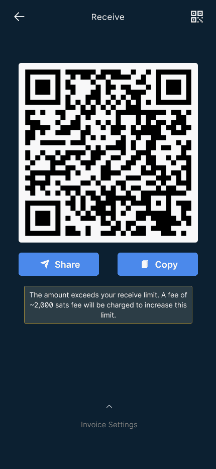
Redesigned Breez receive screen — a live QR with Share and Copy

01The problem

Lightning wallets are built in the open and used in the dark

Self-custodial wallets ship their whole backlog in public. The usability evidence is already written down — in issue threads, in a Telegram group, in Reddit reviews. It is just never read as a body of evidence, so it never becomes design.

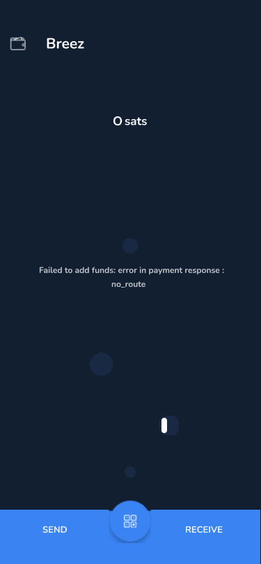
A user who cannot receive a payment does not file a usability report. They write “Failed to add funds: error in payment response: no_route — how will this get resolved?” under an issue number, or they post in r/Bitcoin that twenty thousand sats are stuck. Individually each of those is a support ticket. Together they are a research corpus, and nobody was treating them as one.

So the summer had two halves. First: build a way to read the whole pile — extract it, structure it, filter it, and count it. Second: take what it says one issue at a time and answer it in the interface. 25 issues were worked end to end; two of them turned into full redesigns.

70live UI/UX issues sampled per wallet
3sources — GitHub, Telegram, Reddit
25issues taken through the full three-step teardown
2flows redesigned — Breez receive, Phoenix send max

02How the summer ran

Four steps, and most of it was step two

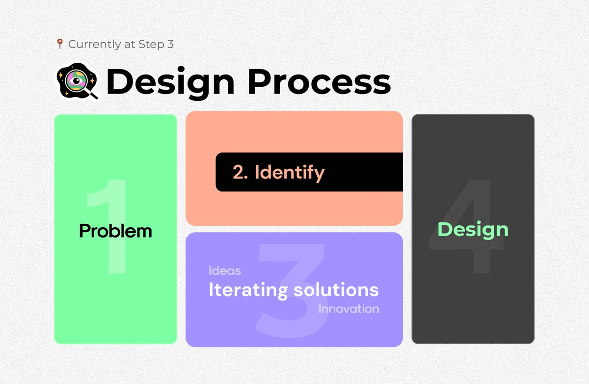
Problem, identify, iterate, design. The frame is unremarkable — what matters is that identification is the widest step, not the narrowest. Sixty per cent of the summer went into reading before a single frame was drawn.

LN UX — Summer of Bitcoin / Design processFigJam
Step 2 of 4

Take one issue at a time and answer three questions in order: what is the user actually saying, which screen are they saying it on, and what would have to change. Every issue in the file is worked through that same three-step card.

The design-process region of the FigJam board, with four coloured step cards

Source — FigJam, “Design Process”The strip above is that region redrawn in markup rather than screenshotted, so the text stays selectable and the cards stay legible on a phone. The palette is the board’s own; it never leaves the board frame.

Step 3, on paper

Before any frame gets drawn, the move gets drawn — three pages that argue the structure rather than the pixels. These are the Breez receive flow reduced to boxes and a fork, which is the level at which the problem is actually visible.

01

What the flow is really shaped like

3 waysQR, at last
Four boxes and a fork. The fork is the problem: it asks for a decision before it gives anything back.
02

Collapse the fork

BTC addrbuycode first
The common case has one answer. Make that answer the screen, and demote the fork to two buttons on it.
03

Let the detail live underneath

livenothingnavigates
Amount and memo pull up over the code instead of preceding it. Nothing navigates; the code redraws.

Schematics, drawn for this write-up rather than scanned from 2024 — the reasoning is the artefact, not the paper.

03Method

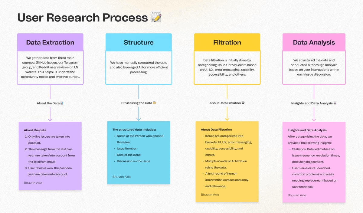
A pipeline, because a reading list does not scale

Extraction, structure, filtration, analysis. AI does the volume work — several rounds of bucketing — and a human does the last round, because a mis-bucketed issue is worse than an unread one.

LN UX — Summer of Bitcoin / User research processFigJam

Select a stage to open its note

Two rules kept the corpus honest. Only live issues count — a closed thread is a decision already made, not evidence. And every extract carries who opened it, the issue number, the date, and the whole discussion, not just the title. Most of the useful material is in the replies: the title says “QR scanner is slow”, the third comment says which Android version and what the user did instead.

The user-research-process region of the FigJam board: four coloured stage cards with sticky notes hanging beneath them

Source — FigJam, “User Research Process”Four stage cards, each with an arrow down to a paper sticky holding the detail. The interactive version above drops one sticky at a time — the board shows all four at once because a canvas has room and a page column does not.

04AI in the loop

What a model was allowed to decide, and what it wasn't

The board says it plainly: structuring “leveraged AI for more efficient processing”, and filtration ran “multiple rounds of AI filtration” with “a final round of human intervention”. That last clause is the whole design of the loop.

AI is what made a corpus this size readable by one person in one summer. It is also the fastest way to produce confident, well-formatted, wrong counts — and a count is exactly what the rest of this page rests on. So the split is deliberate: the model does the volume work that has a checkable answer, and a human owns every step where being wrong is invisible.

StepHumanAIAI + human
01Human

Scope the pull

Decide what counts as evidence before anything is collected: live issues only, two years of Telegram, one year of Reddit. A model given an unscoped corpus will happily analyse three-year-old closed tickets and report a trend.

What it leaves behindThree source definitions and their time windows
02AI + human

Extract the threads

Pull whole discussions, not titles. The title says “QR scanner is slow”; the third reply says which Android build and what the user did instead — and that reply is the finding.

What it leaves behindRaw threads with every comment attached
03AI

Structure into records

Turn free text into a table: who opened it, issue number, date, full discussion. This is the step where AI earns its place — it is mechanical, high-volume, and easy to spot-check against the source.

What it leaves behindOne row per issue, four fields
04AI

Bucket, in rounds

Sort into UI, UX, error messaging, usability, accessibility and other. Run it more than once: a single pass puts anything with the word “error” in error messaging, including a layout bug in an error dialog. Successive rounds re-read the record rather than the label.

Repeats until the buckets stop moving
What it leaves behindSix buckets, several passes
05Human

Adjudicate the last round

A final human pass on every bucket. This is not a rubber stamp: a mis-bucketed issue is worse than an unread one, because it silently changes the counts that the whole analysis rests on.

What it leaves behindThe counts the page quotes
06Human

Read the discussions

Analysis happens on the user interactions inside each thread — who agreed, who reproduced it, who said it was already fixed. That judgement stays human, because it is the part that turns a count into a claim.

What it leaves behindStatistics, and the pain points behind them
What it was given

Volume work with a checkable answer — parsing threads into records, and proposing a bucket for each one.

What it was not given

The scope decision, the final bucket, and every judgement about whether a complaint is a design problem or a support problem.

Why the rounds

One pass classifies on keywords. Re-reading the whole record, several times, is what separates “an error dialog with a layout bug” from “an error message problem”.

The check that matters

Human adjudication on the last round only. Everything upstream can be wrong and recoverable; the last round is what the numbers are built from.

05The corpus

Three sources, three different kinds of honesty

GitHub gets the reproducible defects. Telegram gets the frustration. Reddit gets the thing users say to each other when the developer is not in the room — which is where the wallet actually gets judged.

GitHub

Live issues labelled or related to UI/UX across Breez, Phoenix and Muun.

All open issues

Telegram

The Breez community group — the place users go when the issue tracker feels too formal.

Last 2 years

Reddit

r/Bitcoin and r/BitcoinBeginners reviews and recommendation threads on LN wallets.

Last 1 year

Yeah, not a fan of Breez because of these issues. I also ran into “no route” when trying to make a payment to a merchant. Then, after a period of inactivity, they closed my channel. I did have more than 50k sats, so I was able to withdraw my funds. Is your current channel still open or is it closed? Because if it's open, you should be able to deposit 30k from on-chain without any fees other than the miner fee. If it's closed, you'll have to pay the fee to open a new channel.

r/Bitcoin — “Over 20k stuck in my Breez wallet”

Accessibility, as a share of the sample

One of the numbers the analysis was built to produce. Counting them is the point: “accessibility needs attention” is an opinion, one in seven live issues is a budget line.

Breez10/70
Muun10/70
Phoenix4/70

Buckets the filtration produced

Accessibility & usability#941#485#1218#1077#1118
Error messages#1264#1276#1262
Currency selection#410#1163#1206

Every thread in the review corpus

Not a curated top five — the whole reading list, running. Two lanes: the threads the board captured with a live URL, and the ones it recorded by title alone.

Reddit · PhoenixLightning newbie, question regarding PhoenixReddit · PhoenixWhy does Phoenix Wallet say not to use the same seed phrase on multiple devices?Reddit · PhoenixPhoenix sending error: balance too lowReddit · PhoenixJust closed my channel on Phoenix Wallet… what happened?Reddit · PhoenixIs Phoenix a good lightning wallet?Reddit · PhoenixI can't send LN payments from my Phoenix wallet to StrikeReddit · PhoenixLightning noob struggling setting up Phoenix walletComparisonLightning Wallets Features Comparison TableReddit · PhoenixLightning newbie, question regarding PhoenixReddit · PhoenixWhy does Phoenix Wallet say not to use the same seed phrase on multiple devices?Reddit · PhoenixPhoenix sending error: balance too lowReddit · PhoenixJust closed my channel on Phoenix Wallet… what happened?Reddit · PhoenixIs Phoenix a good lightning wallet?Reddit · PhoenixI can't send LN payments from my Phoenix wallet to StrikeReddit · PhoenixLightning noob struggling setting up Phoenix walletComparisonLightning Wallets Features Comparison Table

16 threads in the review corpusHover to stop · linked rows open the thread

06What the data said

Two piles: things a change fixes, and things a decision fixes

The green wall is where the issue, the cause and the fix all agree — those are schedulable. The red wall is where they do not, and each one needs a product decision before any design is worth drawing.

LN UX — Summer of Bitcoin / Highlights & lowlightsFigJam

Highlights — clear, fixable, agreed

User experience

Automatically close the receive via BTC address dialog when a transaction is detected#1276
Limit the number of decimal places in the BTC amount input field to prevent user errors#1163
Improve clarity of error messages, especially concerning high transaction fees#1264

Accessibility & usability

Enhance accessibility features for receiving invoices#941
Ensure unsaved values do not persist in dialogs like the Avatar picker#1206
Optimize the currency selection dialog for better performance on Android devices#410

Lowlights — unresolved, or contested

User interface

The text for the Tor toggle switch is unclear, leading to confusion about its functionality#1118
Invoices printed for items written in other languages may not display correctly, causing issues in multi-language support#1218
The QR code scanner is unreliable, resulting in failed scans and user frustration#485

Functional inefficiencies

Dates in the weekly transaction report are calculated incorrectly, leading to confusion in transaction tracking#1077
The Buy Bitcoin warning dialog lacks an upper limit, potentially leading to user errors#1262

07The lens

Three frameworks, pinned to the board

A complaint is not a finding until something turns it into one. Three references sit on the research board and do that work: twenty heuristics to name the breach, a friction model to say which kind it is, and an interaction-cost weighting to price it.

01 — Naming the breach: twenty usability heuristics

Select a finding to light up the heuristics it breaks. This is the step that stops “the receive flow feels long” from being an opinion: it breaks simplicity, suitable tempo and precision, and each of those points at a different fix.

01User controlThe interface will allow the user to perceive that they are in control and will allow appropriate control.
02Human limitationsThe interface will not overload the user's cognitive, visual, auditory, tactile, or motor limits.
03Modal integrityThe interface will fit individual tasks within whatever modality is being used: auditory, visual, or motor/kinesthetic.
04AccommodationThe interface will fit the way each user group works and thinks.
05Linguistic clarityThe interface will communicate as efficiently as possible.
06Aesthetic integrityThe interface will have an attractive and appropriate design.
07SimplicityThe interface will present elements simply.
08PredictabilityThe interface will behave in a manner such that users can accurately predict what will happen next.
09InterpretationThe interface will make reasonable guesses about what the user is trying to do.
10AccuracyThe interface will be free from errors.
11Technical clarityThe interface will have the highest possible fidelity.
12FlexibilityThe interface will allow the user to adjust the design for custom use.
13FulfillmentThe interface will provide a satisfying user experience.
14Cultural proprietyThe interface will match the user's social customs and expectations.
15Suitable tempoThe interface will operate at a tempo suitable to the user.
16ConsistencyThe interface will be consistent.
17User supportThe interface will provide additional assistance as needed or requested.
18PrecisionThe interface will allow the users to perform a task exactly.
19ForgivenessThe interface will make actions recoverable.
20ResponsivenessThe interface will inform users about the results of their actions and the interface's status.

20 Usability Heuristics — Weinschenk & Barker, 2000. Pinned to the board as the audit lens; redrawn here rather than reproduced.

02 — Naming the kind: three layers of friction

Interactive friction is what a redesign removes. Cognitive friction is what an information-architecture change removes. Emotional friction is mostly copy and feedback — and it is the layer the error-messaging bucket lives on, which is why that bucket is both the largest and the cheapest to fix.

emotionalcognitiveinteractive

Friction model — UXCam. Redrawn rather than reproduced.

08The ledger

The Phoenix backlog, split UI from UX

The first useful output of the pipeline was not an insight — it was a legible list. Twenty-one live Phoenix issues, sorted by whether the fix is a surface change or a flow change, which is the split that decides who picks it up.

UI issues

  • #566iCloud seed backup error on iOS
  • #552Remove animated navigation on iOS
  • #547App crashes with high send amounts on iOS
  • #535No currency conversion on the Technical Details page
  • #453Management password feature request
  • #440QR scanner is slow on Android
  • #401Custom Electrum server can't connect
  • #190Poor wording on iOS when no route could be found
  • #184Inconsistency in recovery seed phrase on iOS
  • #156Unable to copy transaction ID on Android
  • #7Dark mode problems on Android

UX issues

  • #554Support UnifiedPush on Android
  • #533Discriminate between error messages when paying invoices
  • #515Allow users to see current on-chain fees
  • #503Nostr integration feature request
  • #500Sign and validate feature request
  • #447Improve screen-lock protection
  • #290Accessibility tests
  • #264Support for non-standard lightning addresses
  • #263First payment flow improvement
  • #143Trampoline CLTV estimation

09Identification

One issue, three steps, every time

Know the problem in the user's own words. Find the screen it happens on. Iterate a solution — and mark honestly when there isn't one yet. Twenty-five issues, the same card each time, filterable by wallet and bucket.

WalletBucket25 / 25
BreezUX#556Designed

Receiving costs four screens before a QR code appears

Step 1Know about the problem, in the user’s words
  • The current process for displaying a QR code requires several clicks, making it cumbersome for users.
  • Users must navigate through multiple screens to input amounts, memos, or switch between different receiving methods.
  • The need to perform multiple actions to generate a simple invoice or QR code creates an inefficient user experience.

The current Receive experience requires numerous clicks before a QR code gets shown. This proposal makes it simpler and easier to use. Click Receive, and it already shows a QR code of a 0 sat invoice. Below are optional user inputs: sat amount (as soon as user types in, invoice & QR change), Memo (which is also instantly included in the invoice & QR), Receive via BTC Address button that switches to the swap negotiation screen, and Buy Bitcoin button that switches to the purchase screen. This way, in the common payment request case of 'send me any amount of money', it is as easy as it could be on the receiver side… I think it makes sense to have lightning invoices the convenient default reachable with one click.

MaxHillebrand · 20 Aug 2021 · GitHub #556
Step 2Where, what, why — the screens it happens on

Home → Receive sheet → Receive via Invoice → Invoice modal
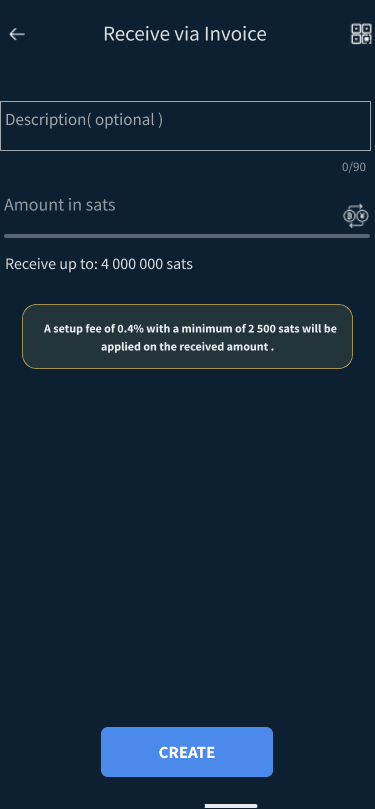
The shipped Receive via Invoice form, captured in the design file as the screen the issue is about
Captured in the design file
Step 3Iterating a solution
  • Upon tapping Receive, show a QR code for a 0-sat invoice immediately.
  • Let users type the sat amount and memo on the same screen, with the invoice and QR updating instantly.
  • Keep 'Receive via BTC Address' and 'Buy Bitcoin' on that screen so switching method costs no navigation.
  • Make lightning invoices the default, reachable in one click.
Some cards end in “already fixed” or “no solution drafted”. Those are kept rather than pruned: an issue that is fixed but still open is itself a finding about the tracker, and inventing a tidy answer for an accessibility bug nobody had solved yet would make the write-up prettier and the research worthless.

10Breez — the problem

Nine screens to answer “send me some sats”

The most-cited UX issue in the Breez corpus is the receive flow. Not because any one screen is bad — because the QR code, the only thing the user came for, is three taps and two decisions deep.

01

First run

“Let's Breez!” is a filled pill; “Restore from backup” is grey type directly beneath it. This is the pair the accidental-new-wallet issue is about.

02

Home

Balance, a status line, and a two-button bar. Everything else in the product is one level down.

03

Tap 1 — Receive sheet

Three routes, none of them a QR code. The sheet asks the user to classify their intent before it will show them anything.

04

Tap 2 — Invoice form

A whole screen of optional inputs, gated behind a CREATE button. The fee notice is here, before the amount is known.

05

Tap 3 — Invoice modal

The QR finally appears, in a modal that has to be dismissed. “Keep Breez open until the payment is completed.”

06

The other branch

The on-chain branch is a separate screen with its own QR — the one whose dialog never closes when funds arrive.

07

When it fails

The API string is the message. No cause, no next step, no way to tell whether the money is gone.

08

The rest of the app

Balance, Podcasts, Point of Sale, Apps. Three of the four have their own issue clusters in the corpus.

09

Podcasts

Boosting sats is the feature nobody can reach from their home screen — the widget request lives here.

Tap → Receive → choose a method → fill a form → CREATE → dismiss a modal. Five actions before a code exists, and the fee notice arrives before the amount does.

The sheet asks the user to classify their intent — invoice, on-chain address, or buy — before it will show them anything. But the common case is not a classification. It is “send me any amount of money”, which has one correct answer: a lightning invoice for zero sats. Every screen between the tap and that code exists to serve the uncommon case.

11Breez — the redesign

Put the QR first, and let everything else happen behind it

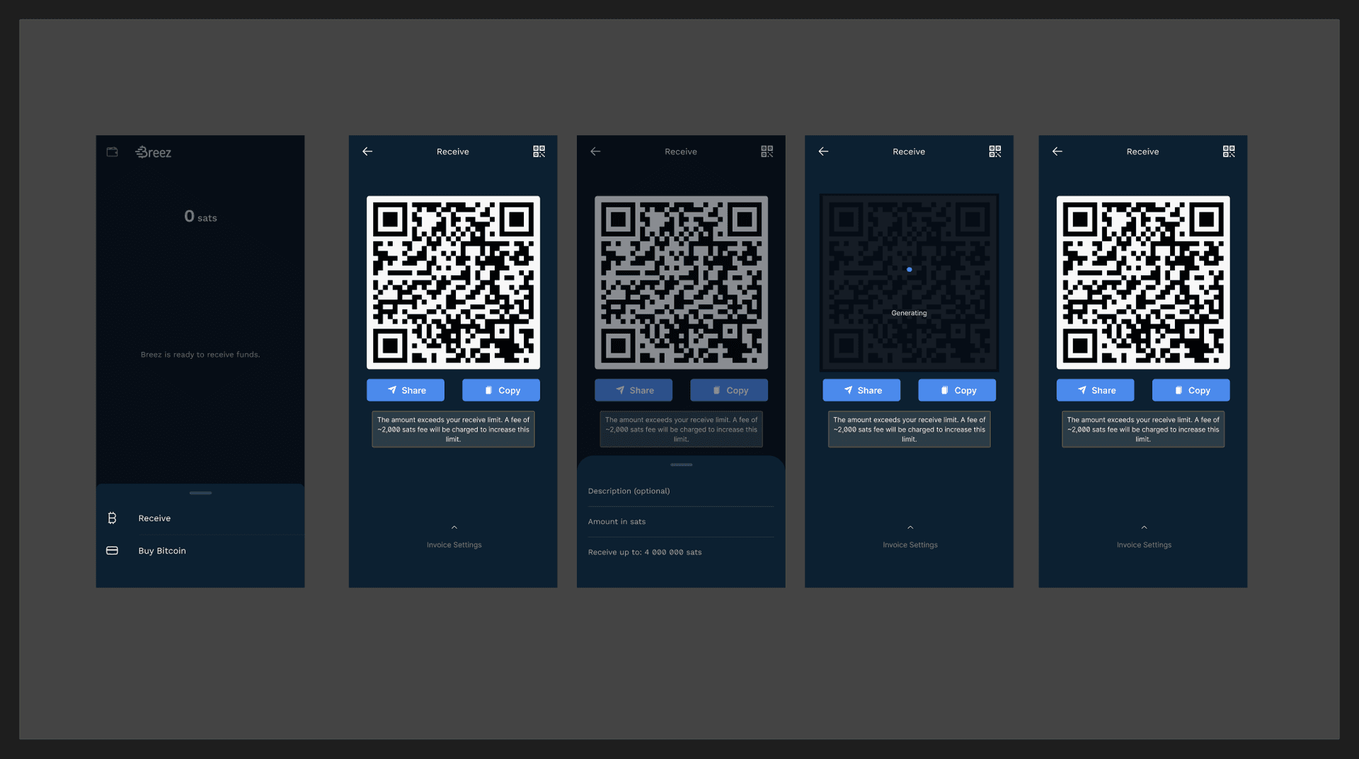
One screen instead of four. The zero-sat invoice generates on entry; amount and memo edit in place and update the code live; the on-chain and buy branches stop being a gate and become options.

01

Two options, not three

“Receive via Invoice” and “Receive via BTC Address” stop being a choice made before you see anything. One Receive, and the method moves inside.

02

The QR is already there

The screen commits to the QR before it has one. A skeleton and “Generating” hold the position, so the layout never jumps and the wait is legible.

03

Zero-sat invoice, one tap in

Share and Copy sit under the code. The fee notice appears only once it is true — attached to the amount that triggered it, not shown pre-emptively on an empty form.

04

Amount and memo, in place

“Invoice Settings” pulls up over the same screen. Typing an amount updates the invoice and the QR behind it; nothing navigates.

The moment the flow turns

Shipped
Redesign

Same job, opposite default

The shipped screen assumes you have a specific amount in mind and makes the general case pay for it. The redesign assumes the general case and makes the specific one a pull-up sheet.

Nothing was removed from the product — every input on the left still exists on the right. What changed is which one you have to deal with before you can hand someone a code.

5 → 1actions between Receive and a scannable code
4 → 1screens in the common receive path
0modals to dismiss before the code is usable

Three decisions that carry it

The QR occupies its slot before it exists. A skeleton labelled “Generating” holds the position, so the layout never reflows and the wait is a state rather than a blank. The fee notice waits until it is true. On the shipped form it sits above an empty amount field, warning about a charge that may never apply; here it attaches to the amount that triggered it. Method stops being a gate. “Receive via BTC Address” and “Buy Bitcoin” move inside the screen, so switching costs a tap instead of a back-navigation.

Pricing the change

The claim “this is simpler” is worth nothing on its own. Scored against the interaction-cost weighting from §07 — where reading costs eight and waiting costs one — the receive flow can be priced, and the two tasks it serves can be priced separately.

TaskWait 1Scroll 2Swipe 3Tap 4Type 6Read 8
As shipped45cost
  • TapReceive4
  • Readthree options on the sheet8
  • TapReceive via Invoice4
  • Readthe form, the limit and the fee notice8
  • TapCREATE4
  • Waitfor the invoice1
  • Readthe modal and its second fee notice8
  • TapShare or Copy4
  • TapCLOSE4
Redesign17cost
  • TapReceive4
  • Waitwhile the 0-sat invoice generates1
  • Readthe code and its limit note8
  • TapShare or Copy4

4517, a 62% drop in interaction cost for “send me any amount”. Scored with the weighting pinned to the board; the step lists are my count of what each flow actually asks for, read off the frames above. Reading is the expensive action — which is why removing two fee notices and a modal moves the number more than removing a tap does.

The Solution Designs section of the Breez Wallet Figma file: five phone frames of the redesigned receive flow

Source — Figma, Breez Wallet / “Solution Designs”The five frames as they sit in the file, including the greyed QR behind the settings sheet. The rail above walks them in flow order instead of file order.

12Phoenix — send max

Two chips that do the arithmetic for you

Issue #36: there is no way to send your whole balance, because the fee reserve has to be subtracted first and the app will not do it. The fix is small, which is exactly why it is worth showing at full size.

Shipped
Redesign

One row, and nothing else

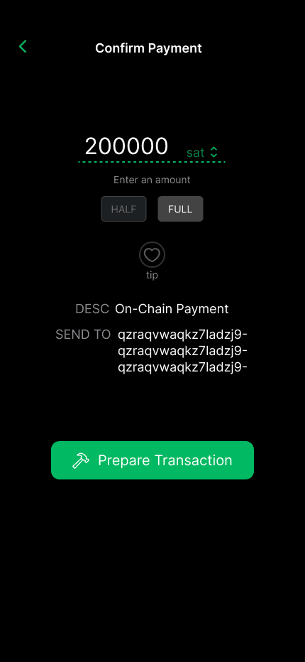
Sending everything used to mean estimating the routing reserve, subtracting it, and typing the difference — a calculation the app is far better placed to do than the person holding it. HALF and FULL are selected states rather than one-shot actions, so at the confirm step the amount still shows where it came from.

Everything above and below the ring is untouched. That is the point: a fix this small is only worth a case study if you can see how small it is, and how long it sat in the tracker anyway.

“When sending to a lightning address or a LNURL-pay invoice, it would be great to have the ability to send max where the full balance minus some reserve for the fee is able to be sent.” — GitHub #36

The three states

HALF / FULL added

Two chips under the amount field, in the app's own tonal button style. Idle state changes nothing about the existing flow.

HALF selected

The chip stays lit while the rest of the payment is reviewed, so the amount's provenance is visible at the confirm step.

FULL selected

FULL is the actual request in issue #36: whole balance, minus the fee reserve, without the user doing the arithmetic.

13Flows

Mapping what the wallet actually asks of people

Six flows across channels, transactions and settings. Drawn to find the branches nobody designs for — the retry, the cancel, the already-set-up — because that is where the corpus's error-message complaints live.

Opening a channel8 steps

Open Breez appNavigate to ChannelsSelect Open ChannelEnter Bitcoin amountReview detailsConfirm channel openingIs channel opening successful?Channel successfully opened
If notRetry channel opening

Closing a channel7 steps

Navigate to channel managementSelect channel to closeChoose Close ChannelReview detailsConfirm closureIs the channel closure confirmed?Channel closed successfully
If notCancel closure

Every diamond in these flows is a place the shipped app currently answers with a raw string. “Is channel opening successful?” resolves to error in payment response: no_route. “Is the channel closure confirmed?” resolves to “Failed to retrieve fee. Please try again later.” Mapping the flows is what turns eight scattered error-message issues into one recurring failure of the same kind.

14What I'd do next

The parts I would put in front of a user first

The research stands on its own — it is a census of what people already said. The design response is a set of arguments, and these three are the ones I would rather test than defend.

Time to a scannable code

From tapping Receive to a QR someone else can scan. That is the whole claim of the Breez redesign and it is directly measurable — run it against the shipped flow with the same ten people and count seconds, not taps.

Does the fee notice still land?

Moving the setup-fee warning from “always visible” to “shown when it applies” is the riskiest change here. If people are surprised by a 2,500-sat fee after the redesign, the timing is wrong and the notice goes back up.

Rewrite one error, then re-count

Error messaging is the largest bucket in the corpus. Rewrite no_route alone into a cause and a next step, ship it, and re-run the extraction a quarter later. If the bucket shrinks, the method is worth repeating on the rest.

The working files

Progress posted as it happened