
All work
Cune AI
Underwriters spend 80% of their day moving numbers between a PDF and a spreadsheet. This is the flow that replaced it — and the five surfaces it became.
- Product
- Cune AI — AI underwriting workspace for commercial P&C
- Role
- UX research · product design · interface design
- Surface
- Web workspace — intake, analysis, doc viewers, copilot
01 · The reality
The bottleneck is not judgement. It is transcription.
Commercial property underwriting runs on documents that were never designed to be read by software, arriving through a channel that was never designed to be a system of record. Four facts shaped everything that followed.
80%
of the day is administration
Underwriters described their own work as copy-paste: pulling numbers out of PDFs and into spreadsheets, then re-typing the same numbers into a core system.
SoThe design problem is not analysis. It is transcription — and transcription is exactly what a machine should have finished before a human opens the file.
400
pages in one submission
A single commercial property submission arrives as a stack: ACORD forms, a schedule of values, five years of loss runs, financials, safety reports — spread across email attachments.
SoNo interface can make 400 pages pleasant to read. It can decide what gets read, in what order, and what never needs to be read at all.
is the real system of record
Guidewire, Duck Creek, Majesco and Sapiens are all in the stack, and none of them are where the work happens. The work happens in an inbox, a PDF reader and Excel.
SoMeet the work where it already is. A forwarded email is a lower-friction entry point than any integration — and it needs no permission from IT.
Lost
business, not lost time
Slow turnaround loses the account to whoever quoted first. Inconsistent decisions cost twice — once in loss ratio, once in the audit that follows.
SoSpeed and defensibility are the same requirement, not a trade-off. Fast decisions that cannot be explained get reversed.
02 · Method
Five passes, in this order
Each pass had to earn the next one. I did not open a screen file until the flow model was agreed, because otherwise every interface problem looks like a layout problem.
- 01
Role mapping
Split the buyer from the user. Six roles across two rings — who executes daily, who governs — with demographics, tool comfort and the artefacts each one actually touches.
- 02
Artefact audit
Walked a real submission stack end to end: ACORD intake, schedule of values, loss runs, financials, safety reports. Catalogued what is structured, what is scanned, what is missing by default.
- 03
Competitive teardown
Six AI-native platforms and six legacy cores on the same axes: time to first value, share of work automated, and how citable the answer is. Where I could get into the product I walked it screen by screen, which is where the appetite-column decision in section 07 came from.
- 04
Flow modelling
Modelled submission-to-decision as one graph — 32 states, three human-in-the-loop branches, one terminal audit trail — so we could argue about the flow before arguing about screens.
- 05
Design against the model
Designed the five surfaces the flow needed, then walked each one back against the model and pinned the reasoning onto the frame. That pinning is section 09.
03 · Who is on the other side
Two rings: who executes, who governs
The person who buys this is not the person who uses it, and the person who uses it most is not the person whose sign-off makes it defensible. Four roles, one interface, different centres of gravity.
Primarydaily execution
Secondarygovernance & oversight
Primary user
Commercial Underwriter
- Demographic
- 30 – 55 · senior and mid-level
- Posture
- High domain expertise, low patience for clutter
Knows the risk cold and has no interest in learning software. Judges a tool in the first ten seconds by whether the screen respects their time. Less familiarity with AI tooling than the analysts under them.
What they are trying to do
- Get through a 400-page document without reading 400 pages
- Run an appetite check against guidelines and see why it passed or failed
- Keep notes that survive the handover to whoever audits this later
- Turn a PDF schedule into a table without re-typing it
- Reach the rating factor table without hunting for it
What they touch
400-page submissionsAppetite guidelinesRating factor tablesReview notes
What the interface owes them
Density is fine; ambiguity is not. This role gets a decision-first surface — verdict, reason, source — with the document one click behind it.
04 · What is broken today
A process problem that bills as a revenue problem
Nobody described the pain as software pain. They described losing accounts to whoever quoted first, and defending decisions they could no longer reconstruct.
Process
Manual process overload
- 80% copy-paste administration work
- Heavy reliance on email, PDFs and spreadsheets
- Back-and-forth follow-ups with brokers, by hand
Consequence
Business impact
- Slow turnaround time leads to lost business
- Inconsistent risk decisions across the desk
- High operating cost per submission
Requirement
Core job functions needed
- Document parsing automation
- Structured data conversion
- Risk assessment support
- Guidelines mapping
05 · The bar
Underwriter-first. No-nonsense. Calm.
Three words came out of the research and stayed on the wall. They are not brand adjectives — each one is a test I could fail a design against.
Underwriter-first
Built around underwriter workflows and priorities — not around what the model can do.
No-nonsense
Clean and efficient. Medium-high data density is welcome; decoration is not.
Calm
Reduces stress through predictable, controlled interactions. Nothing moves unless the user moved it.
Core attributeUser expectationThe test I applied
Trustworthy & defensibleEvery insight links back to source with a citation trailCan I click a number and land on the page it came from?
Fast & efficientCut submission-to-decision time; fewer steps and tabsHow much is already done when I first open the file?
Clear, accurate & consistentStandardised decision quality with governance built inWould a second underwriter reach the same verdict, for the same stated reason?
Control & confidence
- AI suggestions are helpful, never pushy
- Everything explainable and citable
- Complete audit trail for defensibility
Speed & efficiency
- Zero-integration start from a forwarded email
- Automate 70% before the underwriter engages
- Fewer steps, tabs and email exchanges
Interface requirements
- Medium-high data density, but scannable
- Split-panel workflow support
- Document-first and decision-first, together
06 · Where there is room
Everyone automates. Almost nobody shows their work.
Six AI-native platforms and six legacy cores, read on the two axes an underwriting buyer actually decides on: how long until it is useful, and whether its output can be defended. Select a player — the four I could get into carry the screens I walked.
Answer is citable →Longer to first value →
The open corner
Direct competitor
Cune AI
AI-native underwriting workspace, entered from a forwarded email
- 70% of the work finished before the underwriter engages
- Citations and an audit trail on every insight
- No core-system migration to start
- Suggestions are suggestive, editable and tracked
Screens I walked
CapabilityWhat the field doesWhere Cune sits
Integration Require system migration Zero-integration wedge
Trust Limited transparency Full citations + audit trail
Adoption Complex implementation Start from a forwarded email
The gap is not more automation. It is automation an underwriter can put their name to — which makes citations a market position, not a feature.
07 · Reference to decision
The hardest column on the desk
What goes in the appetite column decides whether the queue is useful. Two products in the field solve it well. This is what I took from each, and where the design landed.
Reference · Sixfold
The score never travels alone. The ring is a scale rather than a badge, the verdict is stated in words, and the three signals that produced it sit immediately beside it.
Reference · UnderwritePro
Fit, recommended action and activity each get their own card. The next step is a piece of interface the underwriter can act on, not a sentence buried in a summary.
Where it landed
Named risk signals in the appetite column
- Named risk signals carry the appetite column, so the reason travels with the row
- The two highest-severity signals surface; the rest collapse into a count
- Severity decides the order, so the worst thing is always the first thing read
- Status stays adjacent, so machine progress and risk read as separate facts
The desk gets what Sixfold gets — a reason attached to the verdict — at the density a commercial P&C queue actually runs at.
08 · The flow I modelled
Submission to decision, as one graph
Thirty-two states, five acts, three ways out of human review. Modelling it as one artefact surfaced the branch that did not exist — and that branch was the commonest one.
01
Intake
Broker
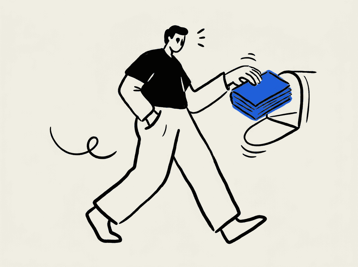
Forwarding the package to a Cune address is the entire onboarding.
- Submission package arrives
- Intake module picks it up
- Zero-integration wedgeNo core-system migration
02
Document processing
Machine
Every copy-paste step, unattended — 70% done before a human looks.

- Agents open the package
- Parse documentsPDFs, sheets, images
- Extract structured dataCoverage, claims, value
03
Analysis & triage
Machine
Three lanes in parallel, each ending in a surface a human can argue with.
- SOV & loss runsAnomalies → flagged table
- Risk assessmentHistory, trends, controls
- Appetite checkPass / warn / fail + why
04
Handover
System
The first thing a human sees. A summary, not a dump — the product's key screen.
- Generate smart summaryMatters · missing · next
- Surface risk & next stepsRanked, not dumped
- Submission workspaceUnderwriter entry point
05
Human review
Underwriter
Tools that are always available, never modal. The gate asks about information.
- AI copilotAsk questions, run agents
- Trust controlsEdit, approve, lock, cite
- Information complete?
Three ways out of review
The most common exit, and the one the build had no home for. Cune drafts the ask rather than making the underwriter compose it — then holds the thread until the answer lands.
- 01Broker follow-up flow
- 02Generate question packs & draftsPre-written, editable
- 03Inbox / chat moduleExternal communication, in-product
- 04Await broker responseSubmission stays parked, not stalled
- 05Update submission workspaceNew docs map onto the same submission
- 06→ back to review
09 · The design
Five surfaces, with the reasoning pinned on
Thirty-seven annotations across the five screens — each one a decision and the research or reference behind it, pinned onto the frame it lives on. Pick a screen, then a pin.
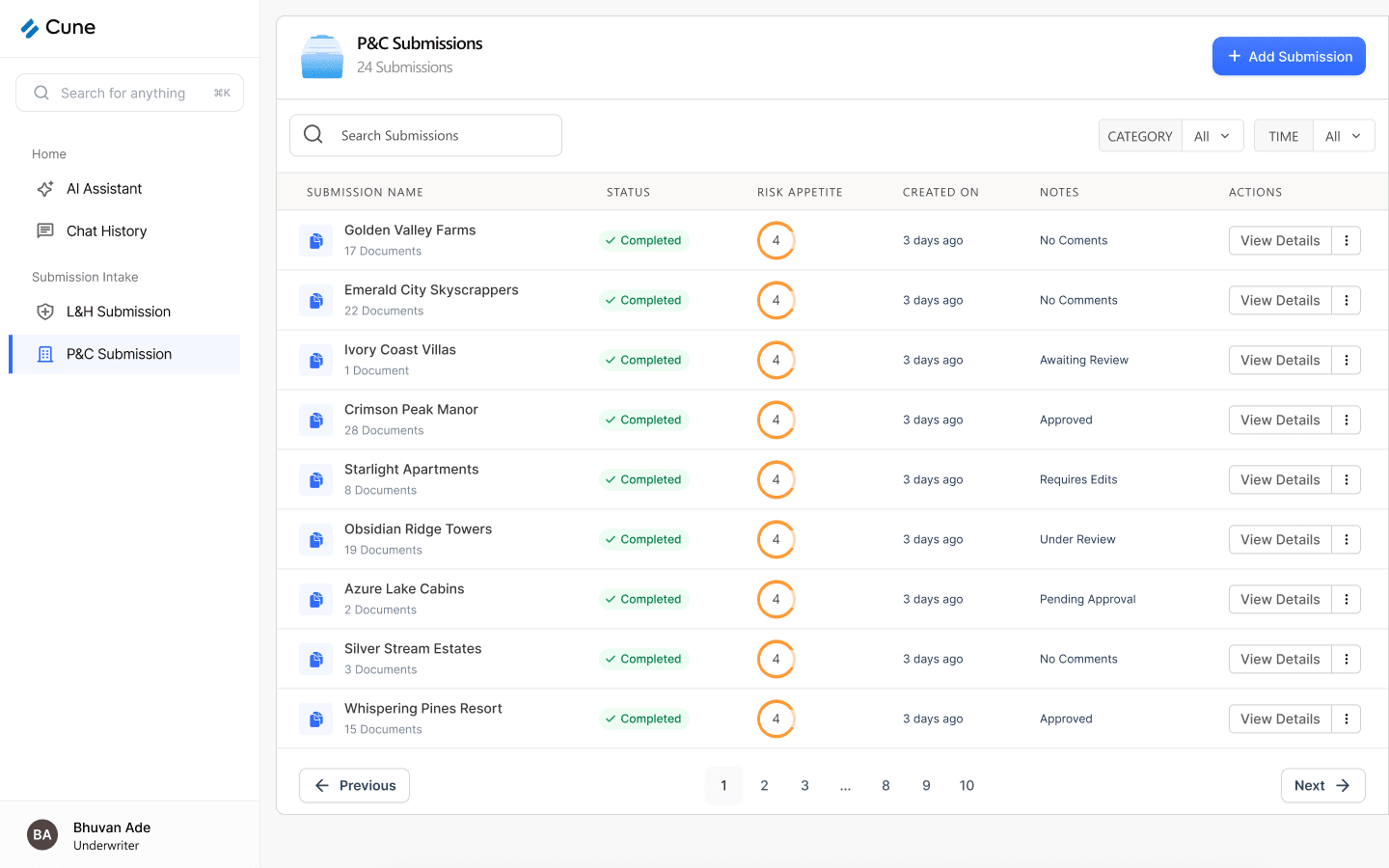
The desk. Where an underwriter decides what to open next.
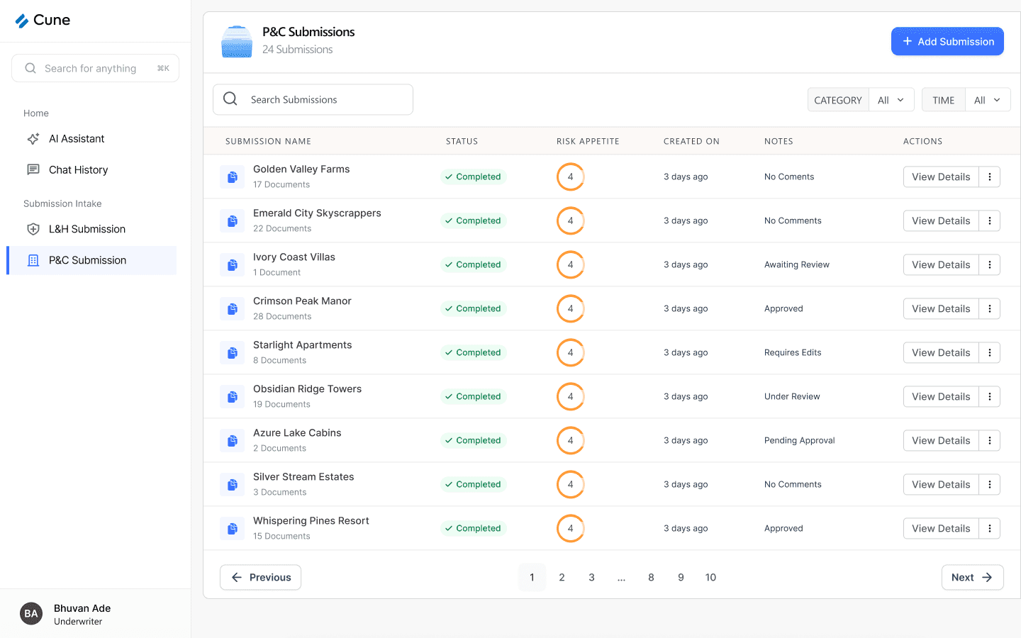
A graded ring in a dedicated column, read before anything is opened. It is the first column an underwriter's eye lands on after the account name, which is why it holds the triage signal rather than a metadata field.
WhyUnderwriters told me they judge a file in the first ten seconds. Sixfold puts the same signal in the same place — see section 07 for what I took from it.
This column is the extraction job's state. Keeping it narrow and literal means it never has to stand in for where the underwriting decision has got to.
WhyThe product I inherited had one status doing both jobs, so Completed was read as the decision being done. Splitting them was the first structural fix.
Awaiting Review, Under Review, Pending Approval, Requires Edits, Approved — the human half of the workflow, in its own column beside the machine half.
WhyGovernance was the Underwriting Head's whole requirement: consistency across the desk. That needs a visible decision state, not an inbox.
Seventeen documents or one document, stated before you commit. It sets the size of the read at the moment you are choosing what to read.
WhySubmissions arrive as stacks of up to 400 pages. The count is the cheapest possible expectation-setter.
Add Submission is the only filled button on the screen. Everything else — filters, row actions, pagination — is quiet by comparison.
WhyThe zero-integration entry point is the product's market position. It earns the single loudest control on the desk.
Search sits left and wide because it is the fast path once a desk has hundreds of files; the two filters sit right, narrow, and default to All so nothing is hidden by accident.
WhyTwenty-four submissions today, but the same screen has to hold a full book. Filters that default to open scale without surprising anyone.
View Details is spelled out; secondary actions live behind the kebab. Nine rows of two visible buttons each would make the table louder than the data in it.
WhyCalm was one of the three principles: medium-high data density is fine, competing affordances are not.
Name and role pinned to the bottom of the sidebar, persistent across every surface in the product.
WhyApprovals, locks and the change log all attribute to a person. If the file has to be defensible a year later, who is looking at it is not a detail.
Load-bearing decision Trust & provenance Craft detail
10 · What changed
Eight moves, each one traceable to research
Three are flow additions the product did not have. Five are hierarchy and signal decisions that could only be made once the flow was settled.
Flow addition
Request missing documents, in-product
WasUnderwriter notices a gap, switches to Outlook, writes the ask, waits, then manually files the reply.
NowA document checklist per submission, a generated question pack, and inbound mail that attaches itself to the right file.
Flow addition
Status tags and notes that hold context
WasOne status column describing the extraction job, and no place for the desk to record where a decision had got to.
NowMachine state and decision state as separate columns, with recurring notes promoted to tags that carry fixed severity colour.
Hierarchy
Provenance you can walk into
WasA flat list of eight step labels with no way into any of them, closing on a single Show Analysis link.
NowEvery step opens the document it read, steps are named after the artefacts underwriters recognise, and the report closes the trail in its own marked band.
Trust
Citations on every figure, at document level
WasA generated report with no route from a number back to the page it came from.
NowCited spans highlighted inline where they are used, Ask Cune scoped to the selection, and severity tags mirrored onto each source document.
Copilot
A scoped, sourced, specific assistant
WasA general assistant with no relationship to a submission — so it had no documents to reason over.
NowDocked in the same position inside every viewer, scoped to the open file, with named suggestions and toggles that stay off until asked.
Signal
Colour means severity, or it does not appear
WasColour applied per screen with no shared meaning, so the same hue read differently in two places.
NowOne hue per severity level, identical from queue row to document flag to cell marker, and a single blue reserved for the AI.
Reliability
Failure has a design
WasTwo outcomes — completed or failed — with no reason attached and no way to retry a single step.
NowOne state machine driving every readout, per-step failure with a stated reason and a retry, and partial success as a real outcome.
Completion
Finishing is a handover, not a full stop
WasAnalysis completed and offered a download.
NowStart review, export the UW-ready packet, share with the desk, request what is missing — and everything logged to the audit trail.
11 · What it taught me
Six things I will take to the next dense product
None of these are about underwriting. They are about designing interfaces where a machine did most of the work and a human has to sign their name to the result.
- 01
A score is only useful next to its reasons
The strongest thing in the competitive research was not a smarter model — it was a ring with three named signals beside it. Once the reason travels with the verdict, the number stops needing to be explained.
- 02
Machine progress and human progress need separate words
One status column serving both an extraction job and an underwriting decision means the user inherits the ambiguity. Splitting them was the smallest change with the largest effect on the whole product.
- 03
The exit you do not design is the one they take most
Missing documents was the commonest real path out of review and had no home in the product — so it left through email, taking the audit trail with it. Modelling the flow first is what surfaced it.
- 04
Calm is a hierarchy decision, not a palette decision
Density was never the problem; competing emphasis was. One primary action per surface, one reading order per table, and the same component in the same place across five screens is what makes a dense product feel quiet.
- 05
Citations are load-bearing in a regulated workflow
In consumer AI, sources are a trust nicety. In underwriting, an uncitable figure is unusable — the file has to survive an audit a year after the decision, which is why provenance became navigation rather than a separate screen.
- 06
Borrow the conventions your users already own
COPE for the analysis, Excel's own right-click menu for the grid, ACORD and schedule-of-values as step names. Every convention borrowed is a thing nobody has to be trained on.
Keep going
More of the same care, elsewhere
UX research · 0 → 1
Aurora AI
A consumer agent that searches the offline economy by calling businesses in parallel.
Product flows
Recepto
Four flow studies covering a complete job each, from lead to infrastructure.
Selected work
Everything else
The grove — client work and design projects that grew from the roots.
Research and screens designed in Figma. Competitive references are the vendors' own products, shown as research inputs.